
4 Years, 135 Posts & Thank You

Today marks the 4-year anniversary of this blog. It’s been an honor to share the history of Reed Brothers Dodge – whether you’ve read our blog, followed us on Twitter, or “liked” us on Facebook. I would like to thank those mentioned below, and many others, for their kind words and the visibility they have provided.
To help review the past year I thought I’d search around on the Internet and see what others have been saying about us.
Included among the posts on our Facebook page:
“I’m the curator of the Dodge Brothers exhibit at Meadow Brook Hall outside of Detroit…. I’ve been following the great history on your Facebook page and blog for a while”
“Want more information. Please post more!”
Online and in print:
- Norris-Banonis.com Three of Reed Brothers Dodge photographs were featured in the month of May 2015 Norris-Banonis Automotive Wall Calendar which features a 1952 Dodge Coronet. The main part of the calendar features a photograph of Lewis Reed and a small snippet of history.
1915: Lewis Reed opened a Dodge Dealership in Rockville, Maryland. When his brother Edgar returns home from WWI, he gives him 1/3 interest. Eventually, the Reed Brothers will carry Hudson, Oldsmobile, Goodyear Tires, and General Electric Appliances. They will also open the first Gulf brand gasoline station in the area.
At the bottom of the calendar, there is a photo of the 1936 Reed Brothers Dodge canopied Gulf Gas Station and Lewis Reed’s original 1915 Rockville Garage.

- Peerless Rockville: As a part of Peerless Rockville’s “On the Go: Rockville Pike and Car Culture” lecture series, Peerless Rockville Historian, Dr Teresa Lachin offered a glimpse into the history of Reed Brothers Dodge as one of the City’s oldest and longest lasting automobile businesses.

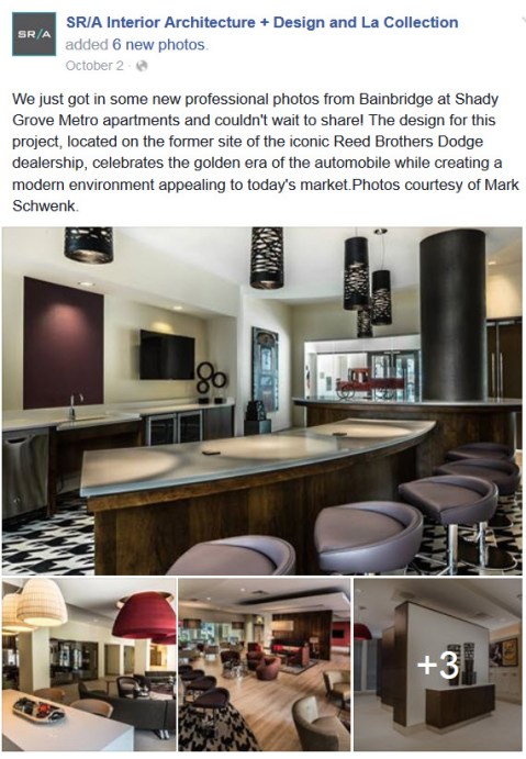
- SR/A Interior Architecture + Design and La Collection: With their reputation for the use of historically referenced materials and detailing, SR/A Interior Architecture and Design of Bethesda embarked on a challenge to pay tribute to a century of history at the Bainbridge Shady Grove Metro Apartments.

- Rockville Nights Blog: http://www.rockvillenights.com/2015/12/sculpture-commemorates-rockvilles.html – posted a blog entitled, “Sculpture commemorates Rockville’s legendary Reed Brothers Dodge (Photos)”

Blog Post Snippet
On National Television!
- History Channel’s American Pickers Hit Reed Brothers Dodge Blog! The television show that’s watched by about 2.7 million people on the History Channel each week found a 1927 photo of Reed Brothers Dodge on our blog and asked permission to use it in one of their episodes. The image was used in Season 7, Episode 34: “Can’t Catch a Break” when Mike and Frank find an old Dodge Brothers sign. Mike explains a bit of the history of the company and he used the photograph during his explanation.

Last, but certainly not least, I would like to thank YOU for stopping by. I appreciate your patronage, whether it be via our blog, Facebook, Twitter, Pinterest or other social media.

April 6, 1936 Gainesville GA Tornado: Through the Lens of Lewis Reed
One of the deadliest tornadoes in American history hit Gainesville, Georgia on April 6, 1936. And Lewis Reed was there to capture the aftermath. On the 80th anniversary of this epic tornado, I have posted seven original snippets of history that Lewis Reed captured through the lens of his camera that day.
In 1936, two F4 tornadoes tore through the heart of town destroying much of the business district and the county courthouse, trapping hundreds in debris, before moving on to surrounding neighborhoods. The funnel fueled fires all over the area, including the Cooper Pants manufacturing company, where 60 employees were killed. The storm left more than 200 dead, 1,600 injured, 2,000 homeless and millions of dollars in damage. President Franklin Roosevelt toured the city three days later, and returned in 1938 to rededicate the courthouse and city hall after a massive citywide rebuilding effort.
Take a look at some of the sobering aftermath photos of the deadliest tornado to ever hit Georgia … through the lens of Lewis Reed. (click on images for slide show)


Source: Wikipedia – 1936 Tupelo–Gainesville tornado outbreak
Lewis Reed Photo: 1911 Speedwell Touring

Two ladies posing in a 1911 Speedwell Touring car. Photo by Lewis Reed
One of the things I enjoy doing is looking through all of the old photographs in my grandfather’s albums and trying to figure out who and what they are. Unfortunately, the majority of the photos are more than 100 years old and do not come neatly labeled on the back with names, dates, people or places. Anyway, I came across this cool looking car and thought it would be fun to try and identify it, so I went on a quest. The only real clue I had to go on was the “S” on the front of the car.
After some digging, my research has identified the car as a circa 1910 or 1911 Speedwell Touring car — pictured just below is a fully restored 1911 Speedwell Series 11 50HP. Looks the same to me. What do you think?

Fully restored 1911 Speedwell Series 11 50HP. In 2011, this car was offered for sale at auction. It was estimated to sell for $195,000-$225,000 but bidding fell short of the estimate and left the auction unsold.
The Speedwell Motor Car Company was an early United States automobile manufacturing company that produced cars from 1907 to 1914. In 1910, the Speedwell cars and the Wright aircraft were produced in the same factory building. Powering the cars was a Speedwell four-cylinder motor that offered 50 horsepower, making it more than capable of sustaining high speeds. The exterior designs of the Speedwell automobiles were inspired from multiple parts of the automotive industry. Speedwell declared bankruptcy in 1915.
Source: Wikipedia – Speedwell Motor Car Company
That Good Gulf Gasoline
In 1918, the Gulf Refining Co. adopted a brick and tile roof station with canopy supported by four brick columns covering two front driveways. “That Good Gulf” was one of the Company’s marketing slogans for a number of years during the twenties and thirties.
Below are architectural changes in the Reed Brothers Dodge front that can be seen in the photos below taken in the late 1920s. A second story was added to the showroom with a glazed front looking out onto Rockville Pike on the right. A modern drive-through canopy was also added along with new gasoline pumps and Dodge Car and Truck signage. (click on images to enlarge)
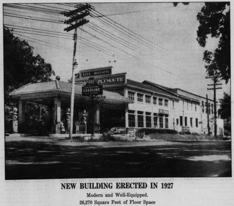

New showroom, canopy and gasoline pumps added in the late 1920s. The Alemite sign in front indicates that Reed Brothers also sold and used the Alemite lubricating system.

A close-up view can be seen of the new gasoline pump-island with four pumping units along with the motor oil dispensers used at that time. The old pump island can be seen to the left along with a new “That Good Gulf Gasoline” sign. In the background is the old St Mary’s Church and Cemetery in Rockville.

That Good Gulf Gasoline drive-through filling station. Note the unpaved dirt road on Rockville Pike and trolley tracks.

Dodge Brothers Motor Car and Graham Brothers Truck signage. Note the onlookers and firetruck on the right by the trolley track.
According to the Gulf Oil Company, the early history of the company from 1909-19 is as follows. “When Gulf was born in 1901 with an oil discovery in Spindletop, Texas, the primary commercial fuel was coal. By 1903, the age of mechanization had arrived and it was now up to the petroleum industry to keep pace, for the age could not proceed without it. Gasoline development, into which Gulf invested millions of dollars, responded to advances in automotive technology. Within a dozen years of Spindletop, Gulf scored notable firsts with the world’s first service station, complimentary Gulf road maps and over water drilling at Ferry Lake. In 1917, the Gulfstream went into World War I service, along with the rest of Gulf’s tanker fleet.”
Feb 8, 1967: Senate Resolution No. 10
On February 8, 1967, the Senate of Maryland passed SENATE RESOLUTION NO. 10 to honor the memory of Lewis Reed shortly after his death on January 28,1967 at the age of 79. The resolution was sponsored by Senator Thomas M. Anderson, Jr and Senator Louise Gore.

Books
![]()
Related Resources


Copyright Notice

Reed Brothers Dodge History (1915-2012) by Jeanne Gartner is licensed under a Creative Commons Attribution-NonCommercial 3.0 Unported License.

Recent Comments